Harkness, part 2: the UI

Now that I finally wrote a blog post about this tiny monitor that sits on my desk, let’s talk about what makes it tick, starting with the UI part that I called the dashboard. After spending some time trying various libraries (usually written in python), I ended up with the simplest concept: a website. This part of Harkness is actually a tiny React application, and all the pretty parts are HTML, CSS, and JavaScript (with Typescript).
Why?
To be honest, I really enjoy working with React. Even if I never took the time to learn it properly, I know just enough to be able to contribute to an existing codebase. For this project, I took the time to skim through the official guide. I used Create React App to… well create a React app and I used Typescript as my language of choice. I don’t really mind writing JavaScript, but I won’t say no to some types. As a sidenote, I find the experience of writing React applications with Typescript inside Visual Studio Code to be nothing short of amazing: autocompletion works well, the browser reloads automatically every time I make a change… Everything that you’d expect for a good developer experience.
The Architecture
I mentioned in my previous blog post that one component of Harkness was a small HTTP server running on the Raspberry Pi. I won’t go into too many details since it deserves its own blog post, but this server has pretty much two endpoints that we care about: one to serve the website from the public directory and one to return a JSON payload with information about the latest commit it knows about, which looks like this:
export interface Commit {
    hash: string;
    message: string;
    repoName: string;
    linesInserted: number;
    linesDeleted: number;
    linesChanged: number;
}
Once the dashboard is loaded, it will start polling the server’s /latest-commit endpoint every few seconds and refresh the UI if that commit changed.
Something that always bothered me with React was writing stateful components with classes. This is most likely due to lack of experience, but I found that large components would quickly get messy and refactoring them was a pain. Fortunately, I recently learned about the concept of hooks, which allow you to write truly functional components. Instead of having a large state property, you end up with a getter and a setter to use inside your component, while some dark magic automatically figures out that your state changed and your component should be re-rendered.
In my situation, the component that fetches and render the commit message looks like this, once simplified:
const CommitMessage = () => {
    const [commit, setCommit] = useState<Commit>();

    // some logic to poll for updates
    if (!commit) {
        return <Loading />;
    }

    return <div>{commit.message}</div>;
};
Once I got excited by the concept of hooks and how clean the component would look like, I looked into how to properly poll for changes. As it turns out, the solution was, more hooks. Specifically, a hook named useEffect that allows you to express side effects in functional components:
useEffect(() => {
    const interval = setInterval(async () => {
        const response = fetch("/latest-commit");
        // some magic to decode the response and handle errors
        // then call the setter that we got earlier from `useState`:
        setCommit(latestCommit);
    }, refreshDelayInMs);

    return () => cleanInterval(interval);
});
This is concise and I like it. More importantly, it is self-contained, and I don’t need to keep reference to that interval in a property somewhere, so we can cancel it if/when the component unmounts.
Themes
I’ve always been impressed by my designer friends and their capacity to produce beautiful designs in a short amount of time. When I started thinking about that project, I saw the opportunity to work on the creative part of my brain. The part that, for the longest time being, thought that #c00 was a good enough choice of colour since “it’s red but like, serious red”.
I started with a simple idea where I would show the message, the name of the project, some information about the change and the hash of the commit. One subtlety is that there are different variants (5 at this time): the layout is the same, but the colours changes depending on the commit. This is the theme I currently have selected as it’s running on my desk, but I actually made a completely different one a few weeks ago.
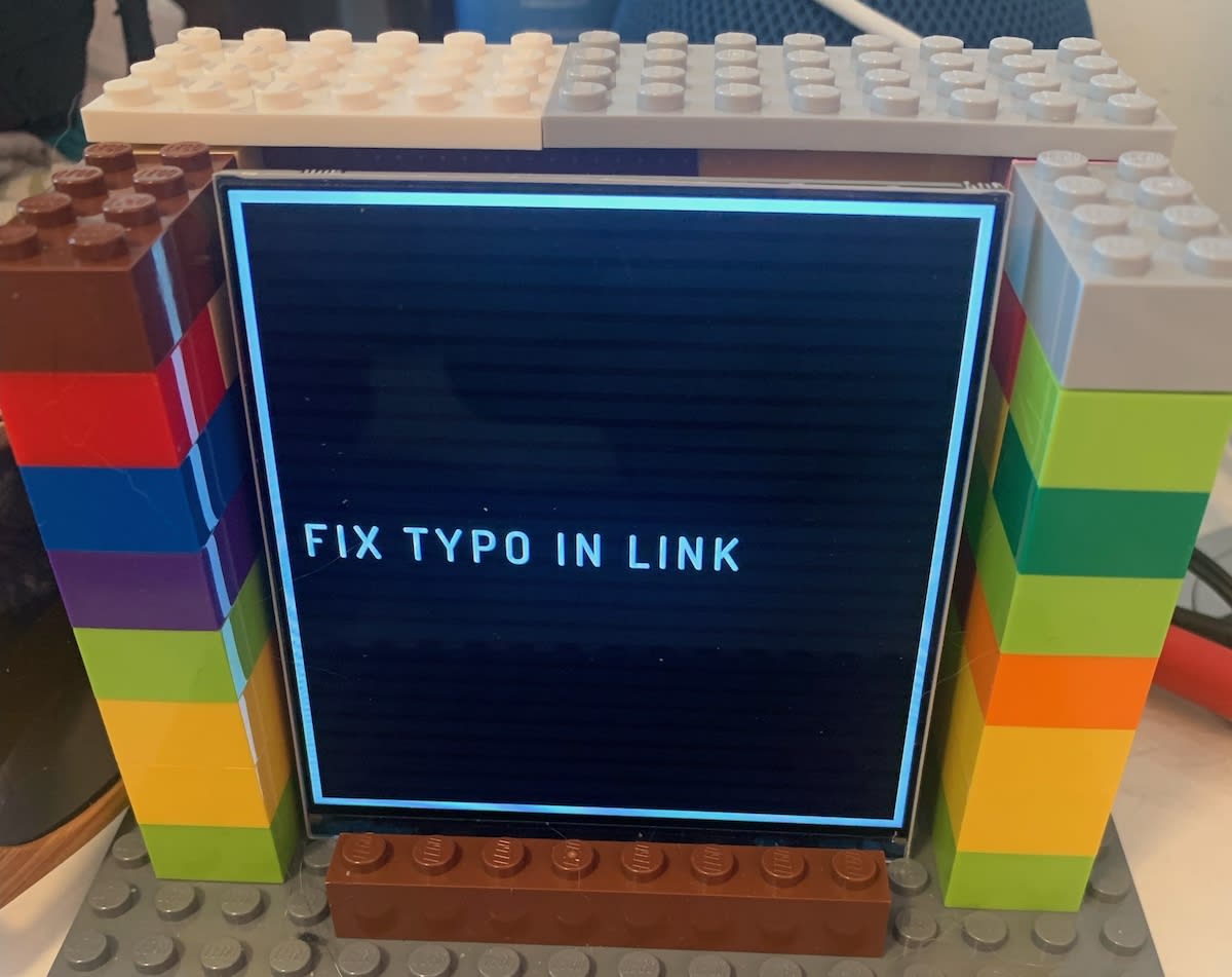
In fact, this is the part that excites me the most, as my goal was to experiment with multiple design ideas in a context where it would make sense. I don’t remember what started this thought process, but I think I saw a friend’s picture where they had a letterboard in the background. This seemed like a cool way to render a commit message and after a quick search, I ran into this cool CodePen by Anyssa Ferreira, which showed me how to recreate a typical letterboard background with CSS gradients.
I’m pretty happy with the way it turned out. I didn’t spend a bunch of time on it, but it confirmed that having multiple themes was worth it and made me happy. Furthermore, I need to clean up the way we choose themes and how this mechanism is tied up to the other components of the project, and I’ll cover that in a future blog post.
